The design of Windows 11

Back in 1987, five-year-old me stood in front of a beige box in my grandmother’s bedroom and marveled at the animations I saw on the connected SVGA monitor. I was playing Math Blaster Plus and saving the universe from critters using the power of math, which I don’t recall being particularly good at but I enjoyed nonetheless. Within a few short years, we replaced DOS with Windows 3.1 and I took a tiny first step in digital art with MS Paint. These early games and versions of Windows were my first interactions with computers and defined not only my childhood but my experience with technology many years later. Like many designers, I eventually switched to the Mac, but now - over 30 years on - I’m looking at Windows 11 to find out how I feel about switching back to the operating system of my youth.
First, a confession: I have a very bad impression of modern-day Windows. This is pretty typical among the creative crowd, likely owed in a large part to Apple’s marketing team and a close relationship between the company and creators of graphics software like Adobe. Some popular apps like Sketch and Final Cut Pro are Mac-only, so if you design for the web or are a motion artist, you’re likely using a Mac. Ironically, if it wouldn’t have been for features like active desktop on Windows 98 I would not have gotten into digital design in the first place, but a few short years later I was a Mac user. Apple understood the end-to-end user experience far earlier than the rest of the computing industry and their focus on UX taught a generation of designers about usability, ergonomics, accessibility, and beauty.
in 2018 I got back into PC gaming after a 20-year hiatus. Despite Apple’s best efforts, gaming on the Mac never took off and the majority of popular titles only ran on PCs running Windows. Since I was on the road frequently for work, I bought a Razer Blade, a computer that I hated from day one. It ran Windows 10, which was an eyesore, and suffered from extreme overheating, battery bloating and hardware issues I had never experienced with my Macbook Pro. When it came time to replace the Razer it was clear that it wasn’t going to be replaced by a Mac (despite the M1 being an incredibly powerful piece of hardware), so I put together a tower PC with the help of the nice people at Mifcom.

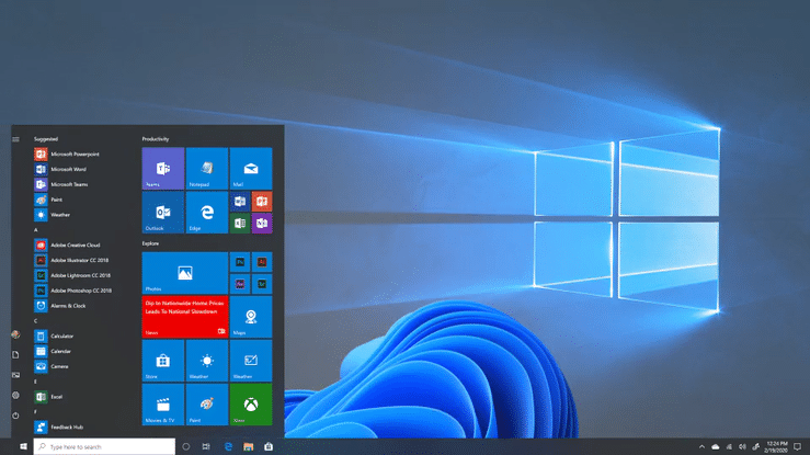
The desktop of my new gaming PC running Windows 11
A change in design mirrors the change in approach
Once I had installed Windows 11 on my new tower PC (and on the poor aging Blade, now on its third battery) I realized there had been a shift at Microsoft. You can learn a lot about an organization and its culture through the user experience of their products, with inconsistently-designed UIs reflecting an organization that works in silos and end-to-end UX more indicative of an organization with departments that interoperate and have an understanding of design and its role in product development. Right out of the box it was clear that the design changes in Windows 11 and the new UI design system, Fluent (great name, by the way), were intended to be more user-centric than previous versions of Windows. This was evident not only in the visual changes but through animations, UI responsiveness, and even new system sounds. It still felt like Windows, but a more human, less intimidating version.
Windows 10 vs. Windows 11 (Image: Microsoft)
In fact, Window’s new design system is reminiscent of Mac OS in many ways. They are entirely distinct UIs, of course, and the intent of Microsoft’s design team was to create something unique to Windows, but some design patterns are similar because, over the years, they became best practices in UI and interaction design that Microsoft was simply slow to adopt. You’ll see this quite a bit as you navigate through the new interface, often without even realizing it; how icons appear in the taskbar when an application is loaded, the way in which they grab your attention when something in the background requires your input, subtle design cues in the taskbar that help you determine whether an application is in the foreground or in the background. All of these are designed to be invisible and that’s one of the tenants of good design - you don’t notice it’s there.
In their medium post about the emotionality of work, Microsoft’s design team talks about how remote working during the pandemic changed the concept of professionalism and influenced their design decisions, for example when redesigning emojis. This is undoubtedly part of the thinking that went into the somewhat radical re-imagining of the Windows UX. Our perception of the lines between “professionalism” and “fun” are blurred and although Apple picked up on this earlier, these lines have been fuzzy in the creative industries far longer. With Microsoft’s new design approach, they are bringing an aging interface up to speed with where the rest of us are three years into the pandemic.
Fluent UI has a big learning curve
Of course, not everyone agrees with the design changes in Windows 11. Some of these may be attributed to the learning curve which comes with changes of this magnitude. For example, moving the start menu and taskbar to the center of the screen, like on a Mac, makes it easier to access your applications on widescreen monitors. If you’ve been looking for the start button in the bottom left corner of your monitor for years, you’re going to be frustrated by this change. The same goes for icons without text labels, which are present in some places of Windows 11’s UI. Learning a new UI is not unlike learning a new language and while there’s a lot that designers can do in order to reduce the barrier to entry, in my opinion, there’s a certain point (which you determine through user testing) where it is acceptable to embrace a learning curve in order to facilitate change and achieve end-to-end consistency.
This is a tricky balance and it gets even trickier when redesigning software used by millions of people who inevitably use the software in different ways. The new Windows 11 desktop removed the Metro UI completely, which was a logical step towards the implementation of Fluent but meant that users needed to adapt to a complete redesign and no longer had access to the tiles they set up and grouped. Evolving design patterns that have been part of your software for many years (some as old as 35!) and adapting them to changing user needs is bold, necessary, and often polarizing.

Responses to Windows 11 on reddit.com
From a design perspective, Windows 11 was released too early
Any design team knows that while they might have a solid vision on paper, implementation is another story altogether and as mentioned in the opening of this article, a company’s culture and business model will often determine the state of the product’s release. It is clear that Microsoft has evolved its thinking on the importance of user-centric design and I believe the work of its design team truly reflects that. Under the hood, however, Windows is a mess of legacy frameworks and systems that do not interoperate, making any effort to create a seamless end-to-end user experience require a complete technical overhaul. Microsoft’s design team knows how to design a consistent UI - that much is clear from their work on Fluent. However the time and effort needed to implement this UI in these legacy frameworks or remove the legacy frameworks altogether- without breaking backward compatibility - is a different story. This results in interfaces like this:

Inconsistent interfaces in the Windows 11 system settings
Coming from the Mac, this example is particularly jarring. When Apple updates the UI of Mac OS, it typically does so across the board. But design at Apple is part of the culture and has been so since the company’s inception. Microsoft has a lot of catching up to do, and, unless they change their business model, a hurdle to overcome if they intend to actively support legacy enterprise systems within the same software. That said, developing an internal design culture is a journey they seem to just have embarked on, and you’ve got to start somewhere.
From a design perspective, Windows 11’s first release is not a 1.0 but a Minimal Viable Product (MVP) - an initial release that contains just enough features to bring user value and achieve business goals while collecting feedback towards the first full release. The question here is if the most widely-used operating system in its 11th iteration should be releasing an MVP instead of a version that overhauls the end-to-end user experience and my answer, as a designer, is no. This overhaul is both overdue and crucial if Microsoft’s design team aims to achieve its vision for a new Windows.
Verdict
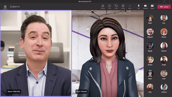
Virtual avatars to combat meeting fatigue (Image: Microsoft)
If Microsoft focuses on hybrid working as the leitmotif in their product design, this can have a significant effect on the way we experience workplace collaboration. Apple’s recent additions to OSX Monterey also center around bringing people together through technology but focus on connecting family and friends, not work colleagues (which is a totally different use case). This puts Microsoft in a unique position to create something truly great out of the advantage they already have as the de-facto operating system in business environments. If they prioritize the end-to-end user experience and address their fragmentation problem, it could very well be that it’ll be Apple playing catch-up in a few years’ time, instead of the other way around.
On a very personal level, I am glad to see Microsoft going in a design-led direction. I’m certainly more inclined to consider a PC laptop for mobile working which would be unthinkable for me five years ago. I like to think that design is something you can’t unsee, which makes me excited about what Microsoft has in store. with much of our work moving into the cloud, perhaps it’s time for us designers to step away from the cult of Mac and consider Windows, or even Linux as alternatives?
One thing’s for certain: the future is bright and it has rounded corners.